flickr introduces responsive photo page

flickr blog:

Flickr’s “liquid” design adjusts the photo page and image size based on the size of your browser window. With that your photos will look great on a laptop screen, and look even more stunning on larger screens.

While I was thinking about how my perfect photo sharing platform would look like, one of my first thoughts was that it should be responsive. So that’s definitely the right way to go. Applause flickr!
But I have to say the positioning of the ‚comments and faves‘ section is a bit strange.
There is also a blog post about the technical stuff.

Building with content choreography

Jordan Moore:

We want to make the most of the confined space and let key content and components flourish, but sometimes our hierarchy of elements can prevent that from happening. Say for example we want to present an article in the narrow single column view, but before the article appears in the stacking order we have: a header (containing site name etc), navigation, maybe even a banner advertisement, then the article. The heart of the page is buried beneath items that may be less important in this context. Rather than brutally hiding these items with a display:none property we can reorder them using another CSS property – flexbox.

Everybody who has some experience with building responsive layouts will love flexbox. Head over to Jordan’s article and learn how it works. Then view his demo. I love it.

Ethan Marcotte answers your responsive web design questions

Ethan Marcotte:

Nelson Rodrigues: What framework do you recommend for a designer and developer duo starting in RWD?

EM: There are a number of great responsive frameworks out there: Foundation by ZURB, Josh Hopkins‘ Fluid Baseline Grid, and Twitter’s 2.0 release of Bootstrap has an optional responsive grid.

Each looks pretty damned promising to me, but I should probably mention I don’t use CSS frameworks for production code. I find them invaluable for prototyping, for getting ideas on the screen as quickly as possible, and seeing how they shake out in a responsive layout. But for final, client-ready deliverables, I like tailoring the code to the design, and finishing up with a responsive design that’s optimised for small screens by default, but progressively enhances up to wider displays.

Agreed. That’s exactly what I think of frameworks like Twitter Bootstrap. I never could imagine using one of these for an actual, real project.
There are also some more bits of knowledge in the Q&A.

Confusing device context with user intent

Josh Clark:

Stripping out content from a mobile website is like a book author stripping out chapters from a paperback just because it’s smaller. We use our phones for everything now; there’s no such thing as „this is mobile content, and this is not.“

Responsive, responsive, responsive – eine Webseite, die sich an alles anpasst und immer den vollen Inhalt perfekt aufbereitet liefert.
Den ganzen Artikel sollte jeder lesen, der irgendwie mit der Entwicklung und dem Design von Webseiten zu tun hat. Und danach gleich noch mal. Und noch mal.

RE: Bandwidth Media Queries

Florian Eckerstorfer:

First of all, JavaScript is not really a solution for serving different image sizes. Any solution that I currently know of needs at to download at least the smallest version in addition to the appropriate image. A very clever solution which nearly worked is described by Mat Marquis.

As far as I know „Adaptive Images“ serves only one image and is therefore the best solution at the moment. I will try it myself in the near future but couldn’t get around to it, yet.

My problem with bandwidth detection is that it will never be really accurate. In its simplest case the browser would just send the speed of the network the user is currently on. However, I can be on 3G but since I am also currently updating a dozen of iPhone Apps, I don’t really can surf using 3G speed. If the browser wants to detect the real bandwidth I currently have, it would need to download some Megabytes and measure how long it takes.

I would be perfectly happy if I could easily detect if the user is on a mobile network or on wifi. The point for me is not so much to serve a small image if the user has little bandwith left for browsing. I want to serve small images to mobile devices if they are not on wifi so my site doesn’t mess with their data limit.
So I could show a small image on an iPad 3 which is on LTE, but a big double sized image on an iPad which is on wifi.

But I can not see how this is ever going to happen. There is now way a browser can detect it. The solution in my opinion has to be on the other side. The device should send some information which the browser then could detect. Or something like that.

All that could be solved if we had super duper fast internet connection everywhere we go. So no one had to worry. Maybe out grand children can have this luxury.
Bandwidth Media Queries

Chris Coyier:

That issue is: bandwidth. If I’m in a place / on a device that has super slow internet, I’d love to be served a very light web page so browsing is still acceptably fast. If I’m in a place / on a device that has super fast internet, by all means ratchet it up and deliver me more.

Chris Coyier wishes for media queries which could detect the bandwidth of the internet connection. This would be to cool to be true.
But even a picture tag, which could deliver different files for different screen sizes would be a step forward. Yes, there are Javascript solutions for that, but it is not perfect and it would be better if there was a simple HTML solution.

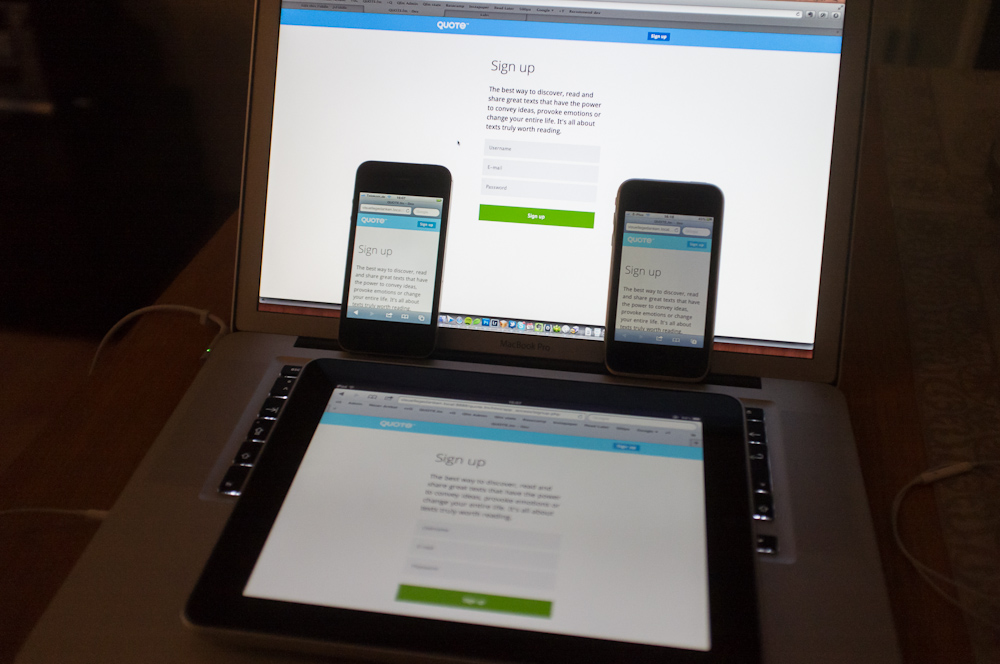
Ich arbeite mit vier Bildschirmen

MediaQueri.es

MediaQueri.es:

A collection of inspirational websites using media queries and responsive web design. Curated by Eivind Uggedal

Wo wir gerade bei der Umsetzung von responsive Designs waren, hier eine Seite voller guter Beispiele. Danke Luise.

responsivepx.com

responsivepx.com:

Enter the url to your site – local or online: both work – and use the controls to adjust the width and height of your viewport to find exact breakpoint widths in pixels.

Sieht nach einem sehr hilfreichen Tool in der Entwicklung von responsive Designs aus. Ich habe schon oft den Browser kleiner geschoben und dann abgemessen, weil ich genaue Daten für meine media queries brauchte – das würde mir dieses Tool deutlich einfacher machen.
Danke für den Tipp, Malte.

Schon wieder alles neu hier

Und schon wieder sieht das hier alles anders aus. Wieso? Weil dieser riesige Text und die große Zeilenbreite des bis vor wenigen Minuten noch aktuellen Designs vielleicht doch etwas zu mutig waren. Aber probieren geht ja bekanntlich über studieren.

Ihr seht jetzt das neue Design. Es heißt bei mir im Backend „vG Farbe“ und gefällt mir gerade echt gut. Ich habe es heute morgen in Photoshop zusammen geklickt und dann im Laufe des Tages – unterbrochen von einer Runde Counterstrike gegen Marcel – umgesetzt.

Es war mal wieder einer dieser typischen Coding-Sonntage bei denen einfach alles flott von der Hand geht. Es ist wie auch der Vorgänger responsive und sollte auch bei kleinerem Browser sowie iPad und iPhone gut aussehen. Die Darstellung auf letzteren beiden werde ich gleich noch mal überprüfen. Also dann, fühlt euch wie zu Hause.