The Right Pseudo Elements Notation

Did you know that there is a difference between pseudo elements and pseudo classes and that they actually should be written differently?

Pseudo classes refer to the state of the selected element, like :hover, :focus or :last-child.

For example:

p:last-child {
    margin-bottom: 0;
}

Pseudo elements on the other hand are actual elements, that get somehow created by CSS. The newest Chrome Dev Tools are making a good job in demonstrating that with actually showing them in the code. To make the difference clear pseudo elements are since CSS3 notated with two colons.

blockqoute::before {
    content: '“';
}

blockqoute::after {
    content: '”';
}

(Be aware, if you need to support IE8 you have to write it in the wrong single-colon CSS 2.1 syntax with only one colon.)

You can read more on pseudo elements at the W3.

Why I didn’t switch to Jekyll

Two weeks back the idea of using Jekyll, a static site generator, to power this blog came back into my head after reading this article by Paul Stamatiou. I had experimented with it somewhen last year and liked it so far but then just forgot about it.

I like the idea that I have everything under control, that there is no database and I just serve static files. Plain and simple. No extra markup coming from a CMS or plugin. So the idea of switching to Jekyll began to take shape.

I wasn’t quite sure if it would be a good idea, so this past week I got up early everyday and started writing a new theme for Jekyll, which, shouldn’t I like my new “CMS”, would be easy to port over to WordPress. In the end that’s what I did. And here is why.

The basics of Jekyll are pretty simple, so after I had a baseline of what I wanted I started to read about how I could migrate all of my posts and metadata from WordPress to Jekyll. There are tons of articles, GitHub Gists and whatnot. But I had trouble making it work. But after hours of struggling and trying dozens of different techniques and scripts I finally had what I wanted. Dozens of markdown files with all the content. 2671 files to be exact. (I used Exitwp and did some cleaning up manually.)

Build Performance

But here lies the first problem. Performance. Building the static site takes relatively long with that amount of posts. And you have to go through that with every change you make on your site or when you write a new post – or when you preview a new post. While developing I only ever generated a handful of posts to speed up the process, but nevertheless, I could see that building performance is or would be a problem in the future. Static site generators might probably be better for smaller sites and blogs which don’t write a lot of posts. But I plan on keeping this blog for the coming years or maybe my whole life, who knows.

This is a good cue, because I have no idea what I want to do with this blog in the future. Maybe it stays small with just one author and not a lot of other features besides articles. But I don’t know, it could also be possible that one day I want to grow it into some kind of magazine or something. And what then? WordPress is capable of pulling that of, Jekyll or any other static site generator is probably not.

Writing and publishing

In the end the only thing that really matters is, are you writing blog posts or not. And to be honest, WordPress makes it pretty damn easy for anyone. You have internet and a browser? Fine, you can blog. You can even use an app on your phone or tablet to publish articles. It’s not that easy with Jekyll. You need a command line, you whole git repository, ruby and whatnot. So another plus for staying with my beloved WordPress. And with some easy tweaks you can write Markdown in WordPress, too. I use Markdown Extra Plugin.

Site Performance

One thing that’s bugging me since I think a lot more about performance is that WordPress can get a little cluttered, code wise. It’s easy to install plugins which inject stylesheets and scripts on every page resulting in extra requests even if you don’t need them. But you can make WordPress really slim if you want to. You can remove code from wp_head and you can edit plugins or simply deactivate a bunch that you just don’t need.
And to further boost the performance, you can even serve static html files with tools like Cachify. Or automatically generate and deliver webp images with Optimus. Both awesome plugins written by my friend Sergej.

So in the end I stayed with WordPress. It’s extremely flexible, future-proof and fast if you treat it the right way. And although  I’m by all means no PHP expert, I know how to customise WordPress and I like to build sites with it.
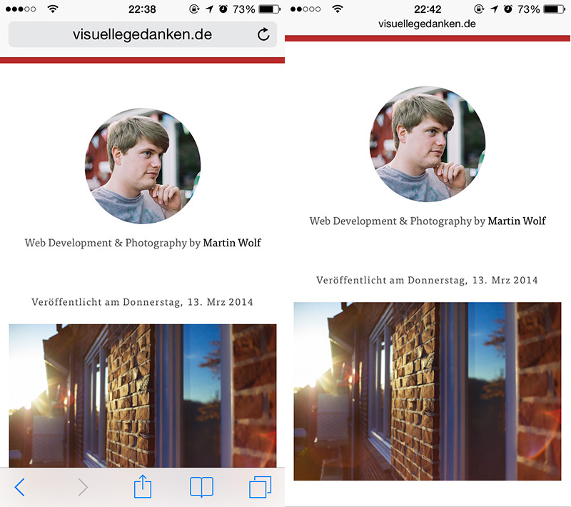
New Blog Design

The new design is a tad simpler than the old one, but I might be putting comments back in and link an archive page and something like that. Also visual tweaks will always happen on the fly. But for now I like it as it is. Clean and simple. If you like to see the source code. It’s on GitHub. Enjoy!

If you have any further questions or feedback, feel free to tweet my at @_martinwolf or send me an e-mail.

Cheers,
Martin

Weekly Recap

Hello everyone, feeling good today? You should, it’s Weekly Recap day! There was actually plenty of things going on the past week. Julia Ann Horvath talking about why she had to leave GitHub, an indiegogo campaign for implementing picture in Blink and much more. Enjoy!

.widget:media(max-width: 30em) {
    /* styles */
}

A Follow Up On The Minimal-UI Viewport Meta Tag

My post on the new viewport meta tag minimal-ui was quite popular, but equally controversial. Some love the addition by Apple and some expressed their concerns regarding the users experience.

I for one was pretty excited about minimal-ui at first but after some thinking about it I have to say it might not be the best choice for the average site. And here is why.

It just confuses the user who has no idea what is happening to him and his browser. There is no hint on how you get back the browser ui and if we are honest, you don’t gain that much either. Just a little bit more screen real estate, which – by the way – you’re getting anyway if you start to scroll. But then it’s the known behaviour and you’re initiating it by yourself. That’s much better.

Nevertheless I think minimal-ui can be a used if you’re building a web app and there might be some other edge cases in which it might make sense.

In my opinion this option should be on the client side. It would be a perfect setting for mobile Safari. So the user could switch to minimal-ui-mode on purpose.

Another code-related problem is that Chrome is showing a Javascript error if you use minimal-ui. That doesn’t alter your sites behaviour but is by all means not a nice thing and does actually bother me a lot. And I’m probably not the only dev who thinks that way.

The key "minimal-ui" is not recognized and ignored. 

But the Chrome team is already on that one. Chrome Canary isn’t showing the error any more.

So before blindly adding minimal-ui to you site think about what you gain and what you might lose. Worst case: Your users.

Weekly Recap

Hey fellow developers and who else might enjoy these lists. Welcome!
The feedback for the Weekly Recap has been great so far. That makes me really happy and keeps me going. This week is a particular good one, I think. That said, let’s not waste any more time and get right into it. Enjoy!

  • Device-Agnostic
    Building and designing websites these days is about more than just a fluid grid. There are so many things to consider which add up to really good web design and development. Screen sizes, touch capabilities, old browsers, slow connection speeds and more.

  • Responsive Web Design – Defining The Damn Thing
    Another attempt at trying to define Responsive Webdesign – by Mark Boulton.

  • Web 25
    This week the Web turned 25, isn’t that awesome? Happy Internet!

  • CSS-Tricks Redesign
    Chris Coyier redesigned the popular CSS-Tricks. He maintains the style of the site and takes it a step further. Responsive as we love it.

  • Multiline placeholder text
    Currently only working in webkit prefix supporting browsers, but a very clever idea.

  • The WhiteHat Aviatorâ„¢ Web Browser
    If you are very concerned about security and think your browser isn’t secure enough, Aviator might be for you.

  • Web Font Trends
    A nice overview of currently popular fonts on the web curated by Jenn Lukas.

  • Dedesign the Web
    A simple game in which you need to guess the website by only looking at a wireframe. I got 6 out of 12 right. Not very good, I guess.

  • Fluidity
    As the author of this site says, the web is almost 100% responsive out of the box. These 107 bytes of CSS fix the ‚almost‘ part. Go have a look at the code.

  • Sublime Text 3 is not dead
    Although I’m currently using Atom to see what it’s capable of, this is very good news.

  • Responsive Interview with Harry Roberts
    Interview with CSSWizard Harry Roberts on all things responsive.

  • Interview with Bryan Jones, creator of CodeKit
    Interview with Bryan Jones about CodeKit 2 and how it all started.

  • Why Mozilla’s mozjpeg project is a big deal
    You might have heard of Mozilla’s mozjpeg project and wondered why they don’t put all of their efforts into webp, here is why mozjpeg is actually a pretty awesome way to go.

Viewport Meta Tag: Minimal-UI

With the introduction of iOS 7.1 Safari understands a new viewport meta tag which automatically reduces the mobile Safari ui to a minimum. I think it’s a great addition and hope other browsers will support it in the future, too.

<meta name="viewport" content="width=device-width, minimal-ui">

Here is my blog before and after adding minimal-ui:

minimal-ui-example

Hint: As a user you can get the menu bar back by tapping on the url.

Update: I wrote a follow up post explaining why minimal-ui might not be such a good idea.

Weekly Recap

Hey everyone, I already told you about the new Editor by GitHub: Atom. It’s an invite only beta at the moment, but I got two more invites to give away. It’s currently Mac only, keep that in mind. So if you want one of the invites, just write a comment. First come, first serve. And now: Happy reading.

  • CSS Shake
    Not that I think this is very useful, but it’s definitely funny. (via)

  • New UI in Firefox Aurora
    Firefox Aurora came out in Version 29 and it sports a new UI, which I really like. (Aurora is even more beta than Firefox beta, but you can get an idea what is coming down the pipe.)

  • CodeKit 2 Release
    CodeKit 2 is here. If you are not a fan of the command line and thus don’t use things like Grunt.js, this is THE app for you.

  • MAMP 3
    And another update to a very useful and already great, if not very good looking, app. Haven’t tried the new version, but it sure looks like it’s a worthy update.

  • Just Do One Thing
    Good advice. Make small steps. Achieve small goals. Feel good and keep going. It’ll add up.

  • Improving the CSS performance of fixed position elements
    Handy trick to stop fixed positioned elements from repainting on scroll.

  • Ridiculously Responsive Social Sharing Buttons
    Social Sharing Buttons are always a pain to implement responsively and responsibly. rrssb is here to help.

iGNANT.de Redesign

Over the past two months I worked on the redesign of iGNANT.de on my weekends. I took over the existing code base and build upon it which made me realise that a lot of things do take quite a while longer if you have to work with a codebase you don’t know. (Surprise!)

Nevertheless I think we did a good job and we can improve on this base in the future. It was a lot of fun and I’m looking forward to working with Clemens and the iGNANT team again in the future.

Screenshot 2014-03-05 15.46.06

Weekly Recap

Biggest news this week was probably GitHub working on a new text editor. The Atom Editor is currently in invite-only Beta. More on that one soon. Until then, have a nice sunday and enjoy the links.

  • Sharing Podcasts
    Dave Rupert explains what the Podcasting Community might need to advance.

  • Retrieve Twitter and Facebook Counts with JSONP
    A simple and easy to use solution by David Walsh for showing Twitter and Facebook Counts without their official Buttons.

  • Posting Code Blocks on a WordPress Site
    Chris Coyier walks you through everything you need to know about blogging about code with WordPress. Highly recommended.

  • Getting started with CSS sourcemaps and in-browser Sass editing
    This week I played around with Sass Sourcemaps and Chrome Workspaces and for some time only worked in Chrome. Editing, viewing, inspecting, saving, everything. No editor needed. It was pretty awesome and I’m curious to see where this is going. As far as I know Firefox also implemented Workspaces in a beta release.

  • Introducing Atom
    Big News this week. GitHub is working on a text editor based on web technologies and they started a invite-only Beta. I managed to get an invite and I like what I see so far.

  • Beyond Tellerrand Conference
    An awesome conference happening in May in Düsseldorf, Germany. Check out the speaker lineup and I’m sure you wanna go. I’ll be there and am looking forward to meeting you guys.

Screencast: Responsive Videos mit FitVids.js

In diesem Screencast zeige ich euch wie ihr ganz leicht Videos responsive machen könnt. Und dazu benutzen wir FitVids.js.

Für mehr Videos, hier abonnieren klicken. Danke!